New and Improved Lumoa – Here are the new features

Last updated on August 25, 2022
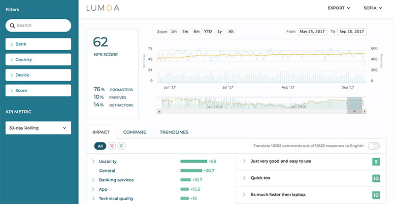
Lumoa just got even better! As of today, new features are available in Lumoa. The update includes new and improved features such as; a new and fresh dashboard design, new timeline chart and new and easier time range selectors.
I’m going to tell you a bit more about the new features, and how the new features will make it even easier for you to act on customer feedback.
Making it easier to act on Customer Feedback
When working with any type of analytics software, one of the most important challenges our customers want to overcome is to get away from overcomplicated software. The reason why many companies decide to invest in a text analytics software is to save time and money by not having to analyze customer feedback manually – making their work easier and more efficient.
Therefore, are we constantly developing Lumoa – trying to make it as user- friendly as possible.
The new and improved features in Lumoa is doing just that – Making it even easier for you to act on customer feedback.
New dashboard Look

We have made some good-looking changes to the dashboard. We have changed colors, increased contrasts and fonts in the dashboard. By doing this, it will be even easier to navigate around in the dashboard. And of course, it’s just stunning to look at!
New Trendline chart

One of the biggest changes that we have made is that we have added a new trendline chart to the dashboard. The new trendline chart is located under the main trendline chart. With the new trendline chart, it’s much easier to follow the development of your NPS score. You can follow the development for the NPS score for the whole lifetime and at the same time now where (in-time) your data comes from.
Data range selection

We have added three new ways to select a time range;
-
You can choose one of the preselected ranges. Just choose between the preset time ranges 1 month, 3 months, 6 months, YTD (year today), one year or all. Use this when you quickly want to see your NPS development during these specific set of time ranges.
-
You can also choose to directly put in a specific range of dates. Maybe you want to find out what kind of feedback you were given and what your NPS score was during a specific time when you made some changes in your service or tested something new.
-
You can also use the new trendline chart to select the time range of your choice. You can drag or stretch the navigator bar to change the time range. Change the length of the navigator bar to change the time range. Drag the navigator bar across the trendline chart to change the time from what time point you want your data to come from. This is a great way to explore the development of your NPS score! By using the new trendline chart you are able to detect changes in the NPS score that stand out, and that you maybe wouldn’t have noticed before.
Time to act!
We have done many improvements to Lumoa that will make it easier for you to get your insights from your customer feedback and give you means for acting on your customer feedback, followed by improved customer experience.
Do you want to know more about Lumoa? Book a Demo with us!
P.S. Stay up to date with new product updates by subscribing to our newsletter!